In this article
- 1. Solving the relative performance problem
- 2. Solving the relative scoring problem
- 3. Linking design with performance
- 4. Reinventing the review format
- 5. Concept inspiration
- 6. Building a proprietary dataset
- 7. The development process
- 8. The final product
- 9. The scoring module
- 10. The biomechanics module
- 11. The comparison module
- 12. The 30 second review
- 13. The before and after module
- 14. The proof of purchase module
- 15. Other interactive modules
- 16. What comes next
Our new review format is now online. But our redesign process began a few years ago, with a simple question.
What should the ideal modern shoe review look like? One that not only addresses the shortcomings of existing review formats, but also reflects the new, and vastly changed, realities of the running shoe industry? If we had to start all over again, what would make a review as helpful as possible?
Solereview’s previous review format lacked three foundational elements.
1. Relative performance: profile-based shoe behavior
A modern carbon-plated racer – or for that matter, a max-stack easy-run trainer – alters its behavior under different speeds, gaits, and other variables. An elite or sub-elite runner who’s clocking speeds of <4:00 min/km will experience the shoe differently than a recreational runner running at 6:00 min/km. A 200-lb runner will cause the same shoe to behave differently than a 140-lb runner would. An overpronating gait may cause the inner midsole to collapse; a heel striker may experience a negative heel-to-toe offset, whereas a forefoot striker may be perfectly fine.
This lack of context was usually addressed through anecdotal experience or separate product guides specific to the runner profile. You know, product guides like “best shoes for overpronators/marathons/heavy runners,” and so on. If this information was addressed in the review, the presentation was inconsistent and lacked evidence-based data. Edge cases were an afterthought, rather than being baked into the review structure.
2. Relative scoring: profile-weighted shoe rating
A single score without profile-based relevance isn’t very helpful. If the shoe’s behavior and relative importance depend on the runner profile, then the rating or score should also be profile-based. A profile-based score also avoids the most common pitfall of a single-score system – a daily trainer should not be penalized for not being as “bouncy and quick” as a carbon-plated racer. On the other hand, a carbon-plated racer should not be penalized for a tight upper fit or the lack of durability that daily training requires. In our previous reviews, penalties were applied if the shoe was weak in foundational areas like stability or traction, but they were not profile-based.
A single score also fails to capture the relative importance of running shoe traits. For example, a recreational runner may value a spacious fit far more than an elite runner, who would rather have a tight, race-day fit. A $300 racer has a weaker value proposition for a recreational runner than for an elite runner; for the latter, the plated racer is the preferred tool of the trade.
In the pre-carbon-plated racer era, a single score made sense. Before 2015, non-elite runners generally avoided low-profile racing flats and their tight uppers, so everyone stayed in their lane, so to speak. A Saucony Ride 7 and a Brooks Ghost 11 were not all that different. That’s not the case today, and that’s the reason why profile-based reviews and scoring are imperative. We see high-performance footwear that has no business being on the feet of certain runners, and there’s nobody telling them, “Hey. These shoes don’t work for you. Here’s why.”
3. Cause and effect
For far too long, running shoe reviews have placed too much importance (guilty as charged) on the tech, rather than what the tech does for the runner. For example, in this 2021 review of the Brooks Hyperion, we went off on a tangent about supercritical foams. In the early days, it was fun to write about new and emerging technologies as they were vastly superior to EVA foams and such.
Sure, adjectives like ‘softer than last year’s version’, ‘bouncier’ and ‘improved responsiveness’ were used to describe how the shoe felt underfoot, but that’s not very helpful. Okay, the midsole has an ‘X’ stack height, ‘Y’ drop, and either uses A-TPU, supercritical foam, or PEBA with a segmented carbon plate – so what? Every other shoe is plated, rockered, soft, snappy, poppy, bouncy, and responsive now, so what’s the difference? Similarly, a durable or lightweight mesh is only as good as the upper fit.
We had to connect the feature or tech with the on-road behavior. For example, if the soft midsole heel has a deep channel, what happens when a heavy runner lands heel first? How does an overly roomy racing shoe fit affect stability and propulsion? Does a soft and bouncy midsole work equally well for an overpronated gait as it does for a neutral gait? We have been doing this in bits and pieces over the years (as in the Adios Pro 4 review), but the presentation was inconsistent.
The whole is greater than the sum of its parts, so it was necessary to adopt an evidence-based approach that combined subjective wear-testing with large-scale observation and data validation.
Reset and relaunch
It became clear that we had to press the reset button, and rebuild our review system from the ground up. We had the challenging task of carrying forward the spirit of what made Solereview special, but leave everything else from the legacy reviews behind. At the same time, the review format would need to be reimagined to address ever-decreasing attention spans. It would also need to deliver lots of information without overwhelming the reader. We also wanted to change the very format of the shoe review, rather than relying on an incremental approach or precedents. It was time to apply the same punishing standards for ourselves that we do when reviewing running shoes.
We decided an interactive, module-based review structure was the best approach. This format, which is now live in the Nike Alphafly 3 review, has three distinct advantages. When designed with intent, each module becomes a self-contained capsule that balances high information density with a manageable cognitive load. A reader in a hurry could quickly read the 30-second review to know whether the shoe works for them – or not. Or they could jump right to the dynamic comparison tool to see how the reviewed shoe compares to its peers. The ‘Cut-in-half’ or teardown module is a material and construction overview; the Magnifier is an image-only review. A module-based design also offers the benefits of future feature upgrades being rolled out site-wide simultaneously.
From an information density standpoint, our modular review is structured with intention. We liken it to a spinning top. The review is lightweight at the beginning (30-second review, best for dashboard, before/after slider), information-dense at the center (profile-based scoring, biomechanics, fit visualizer), before tapering to modules that require a lower cognitive load. (magnifier, comparison, specs)
These self-contained modules also reduce the risk of repetitive information, which was sometimes observed in our previous review format. And particularly for the scoring and biomechanics modules, a runner need not read all six profiles, but just the one that applies to them. This approach respects the reader’s time. We also had to redesign the table of contents, changing it from a link-based system to an iconography-based index. This new approach allows anyone to quickly jump to the relevant section. A properly-designed table of contents would ensure location consistency, making sure the information is in the same place, whether it’s the first review or the hundredth.
Concept inspiration
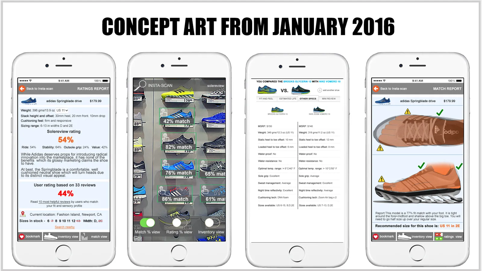
A few of our concepts and mockups from 2016. You can see where the toggle feature and comparison module inspiration came from.
Let’s rewind the clock to a decade ago. On a cold day in January 2016, we asked ourselves: if we had all the available resources and technology to create the ideal shoe review, what would that look like? With that in mind, we spent several weeks creating concepts and mock-ups. The concepts had everything from dynamic drop-down comparison tools to augmented-reality-based tools where you could hover your phone over a shoe and get a review in real time. We got as far as prototyping it, an example of which was posted on our Facebook page.

A wire-framed, 2017 product training tool prototype. We got the magnifier and comparison module inspiration from this mockup.
We used to receive many emails from readers who either worked in, or ran, sporting goods stores. They were using Solereview’s detailed shoe reviews to gain a deeper understanding of the products. That gave us an idea; why not make an app for product training that could just scan the tongue label, identify the shoe, and deliver the information. Again, we got the app idea to a working prototype stage, using tools like OCR (Optical Character Recognition) based on a Regex (Regular Expressions) product code logic. In hindsight, that app would have eventually failed, as most shoe labels have now moved away from the tongue area. However, we built a wealth of UI/UX assets and ideas in the process, including a proper wireframing strategy (the blueprint for the app interaction during usage) from that exercise.
Our previous generation reviews had static infographics like pros and cons, as well as the upper fit visualizer. We already had a weighted scoring concept in place that we first debuted in 2014, except it needed to be updated to modern standards. We had plenty of original material to work with, so all we had to do was look inward.
Building a proprietary dataset

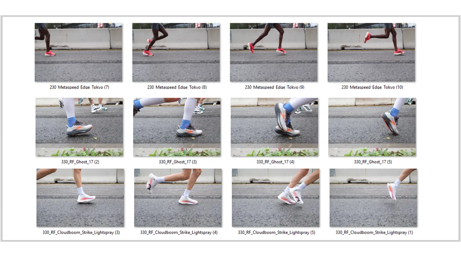
We say with a high degree of confidence that Solereview has the world’s most comprehensive database of high-speed shoe images from actual road-races. In fact, it may be the only such global database of its kind that categorizes the running shoe images by brand, model, runner speed, gait type, and bodyweight. We first began capturing large-scale, race-day shoe performance in 2019, and over the last five years (there was a hiatus of 18 months due to the pandemic), we have photographed (here’s an Instagram post from four years ago), and manually labeled, over 20,000 high-speed images. We have data on nearly every running shoe model, ranging from the humble New Balance Arishi and Brooks Ghost 17 to the Puma Fast R3 and the ON Cloudboom Strike Lightspray. We also understand how model-to-model updates affect their on-feet behavior and response. By the time 2026 comes to an end, we will have collectively amassed close to 30,000 images. We’re now at a stage where the thousands of manually-labeled images can help decrease our future labeling workload by training machine learning.
Many claims (X energy return increase) made by brands are usually based on lab tests. But runners run on the road, not inside a lab. Over the last few years, watching tens of thousands of frames has fundamentally re-wired our understanding of how running shoes actually behave. The chasm between expectation and reality became quickly apparent. In the past, we’ve published (and looking back, nonsensical) sweeping generalizations like ‘the under-heel midsole cavity improves stability by helping center the weight’. Another example would be, ‘the winged design of the Endorphin Speed 4 helps stabilize the rearfoot’. However, our assumption about the Winged design was flat out wrong, as it did very little to manage rearfoot stability, just like how a small foam ‘Guiderail’ on a Brooks shoe does not slow pronation. An under-heel cavity on a softer midsole (eg. Adios Pro 4, Nike Alphafly 3) decreases stability rather than improving it.
Regular readers would have noticed these images from our dataset in different reviews over the years. In the adidas Adios Pro 4 review, we showed you how the shoe behaves under different footstrike and gait conditions. In our Hoka Mach 6 review, we explained how the midsole design affected its compression behavior. We had to find a way to present evidence-based data from this image library in a user-friendly way.
The development process
The development began in 2025, with a target completion date of Dec 31st. That way, we could launch on Jan 1st, and say ‘New year, new Solereview’, or something sillier. However, given the very ambitious nature of the redesign, it felt wise to push the date to January 24th, 2026. All sixteen different modules are custom coded, many with complex math and interaction logic, so we had to make sure we had a functioning version at launch.
Besides making the information more relevant, we also wanted the new review format to be enjoyable. That’s why we decided to make the review interactive. This is the first global instance of a product review where interactivity is the anchor and not an afterthought. Be it selecting speed and gait-based shoe behavior and scoring from six different types, using clickable hot spots to understand the fit and construction, or toggling between before-and-after views, we created the format to be as engaging as possible, all while being refreshingly different from other online reviews. We wanted to evoke the same sense of joy in the readers when they first saw the detailed images, long-form content, and expert analysis on Solereview over a decade ago.
With the launch of this interactive and evidence-based review, we succeeded in setting another trend, among the many others we set over the last 18 years. For example, did you know that Solereview was the first website to feature tear-downs (cut in half) images in 2008? Or that we were the first website to feature gait progression images in a running shoe review in 2014? We were also the first to simulate reflectivity in our product shots, and introduce multi-angle photoshoots at a time when even the biggest brands shot only two side profiles, one top profile, and the outsole.
In 2016, Solereview became the first shoe review website to introduce iconography to represent shoe traits and runner profiles, a practice that became an industry standard shortly after. We have also introduced new phraseology such as ‘supportive neutral’, ‘trampoline effect’, ‘full ground contact’ and ‘motion control’ to the running shoe world. We called out the anachronistic nature of medial posts, and were the first to consistently highlight midsole behavior in freezing and warm temperatures.
Even if Solereview played a minor role in reshaping parts of the athletic footwear industry, we’ll happily accept that credit.
The final product
The new review format is the product of the combined knowledge of running shoe reviewing, formal footwear education, operating elite athlete wear-testing programs, supply chain, footwear design and development, concept art and mockups. We relied on every bit of experience and every asset available at our disposal to reinvent how running shoes are reviewed. While we have plenty of fun modules, we’ll first bring up the two most important ones – the scoring and biomechanics modules. Considering the underlying math and the necessary code structure that produce the calculations and visual effects, these two took the most time and effort to bring to life.
We also spent as much time designing the backend as we did on the frontend interface. Our new backend should shorten content creation time once we develop the muscle memory that the new and unfamiliar editorial process demands. We drew on our learnings and experience in the footwear industry, where we gained a deep understanding of how enterprise management systems work – particularly how they manage data. Besides well-known ERP systems like SAP, we also have experience working with various footwear-specific merchandising software and image cataloguing systems. We incorporated all of what we knew to make the editorial process as intuitive as possible.
The scoring module


This module is divided into pace (running speed) and gait (footstrike, bodyweight, and overpronation) sections. Unlike any existing scoring methodology, the shoe is rated based on the profile and underlying scoring attributes. By assigning different weights or relevance to the scoring attributes, we can display a score that’s relevant only to that profile. For example, when rating a shoe based on the heavy runner profile, the scoring breakdown is based on compression resistance (40% weightage), outsole durability (25% weightage), upper containment (20% weightage), and torsional stiffness (15% weightage). If it’s a heel striker, we place importance on rearfoot stability (35% weightage), negative drop resistance (30% weightage), heel-to-toe transition (20% weightage), and heel lockdown (15% weightage).
Our pace section solves a fundamental problem in running shoe rating systems. It assigns a fair weightage or relevance to the runner profile the shoe was designed for. That means a Saucony Triumph should not be penalized for not feeling as snappy or propulsive as the Saucony Endorphin Pro, and the Endorphin Pro should not be penalized for not being as durable or cushioned as the Saucony Triumph. Again, profiles have different rating attributes assigned to them, so our calculation for the Elite/sub-elite score differs from our scoring for the recreational runner. In shared, cross-profile traits like value proposition or traction, you might see a different score for each profile. Let’s use our Nike Alphafly 3 review as an example. In the pace section, the Elite profile gets 60% rating weightage, followed by 30% for performance/mid-pack, and just 10% for recreational. In simple terms, that means that the Nike Alphafly 3 is 60% relevant for someone running faster than 4:00 min/km, 30% relevant for speeds between 4:00 min/km and 5:30 min/km, and just 10% relevant for speeds over 5:30 min/km. So even though the Alphafly 3 is only a 6.0 for the recreational runner, the overall score is 8.0 because we assigned a 60% weight to the Elite profile, where we rated the shoe an 8.6. On a shoe like Hoka Bondi 9, the reverse logic applies, where a greater weightage is assigned to the recreational runner.
Within the score breakdown section, we rated value proposition as 9.0 for an elite runner, but just 4.0 for the recreational profile. That makes sense, as the Alphafly (or any plated racer) is of greater utility to the serious runner than it is to a recreational/slow runner. We also apply penalties that lower the overall score if the shoe is weak in foundational areas. For example, if a racing flat were to weigh over 200 grams, a 20% penalty would apply. If the stability score for the elite profile dropped below the critical 3.0 scoring threshold, a 25% penalty would apply.
The biomechanical module


Even the most experienced shoe reviewer can’t see what’s really happening to the shoe during a run. What one thinks is happening can be different from what’s actually happening. One can make an educated guess, relying on years of experience and pattern recognition, but that’s no substitute for real-world field observation. The scoring module defines our rating methodology; our biomechanics module validates it. For the first time in the history of shoe reviews, we can now see what happens to the shoe under different conditions. Drawing on our proprietary library of over 20,000 images, we can say, “When a heavy runner lands heel first, this is what happens to the midsole structure.”
We decided the best way to connect the shoe design with behavior was to first show a 3-frame sequence of footstrike/midstance/propulsion, followed by a ‘Mechanics at work’ section underneath. Since running shoes behave differently based on speed, biomechanics, and other related variables, the same feature could produce different cause-and-effect scenarios. It only made sense to call this feature ‘Mechanics at work’. We also built in the functionality to pause the animation so that readers may observe one of the three states in greater detail. For example, they might want to know what the shoe looks like at midstance during a severely overpronated gait. We could also show states like negative drop, when the heel stack is momentarily lower than the forefoot because of loading-induced compression. Our new reviews now combine independent testing and insights with evidence-based data at scale; this is the first, and only such format in the entire world.
Since the data isn’t simulated but collected from road races, the biomechanics module may not be immediately available for new shoes. The new changelog module will be updated when the data is collected and eventually displayed. In some cases, the animated frames may not be available for all six profiles. For example, no elite runner in their right mind will race in the Hoka Bondi 9. In such cases, we’ll replace the animated frame with a static image and predict the mechanics based on our collective experience and observational data acquired from comparable running shoes.
The dynamic comparison module


The idea of a drop-down comparison tool is not a new one. However, we saw an opportunity to improve the way information was presented. Most comparison tools tend to focus on the tech and specs, and skim over the aspects that matter – like use cases (best for), fit and ride character. Our drop-down comparison module compares two shoes by sorting the information into four separate headings – ‘Best for’, upper fit, ride quality, and specs. As we continue adding shoes to the master database, readers can compare the reviewed shoe with most of its peers.
The 30-second review module
When short on time, readers can quickly scan this module. Here, we distill the shoe’s overall character, pros and cons, verdict, and potential issues into a reading time of under half a minute.
The ‘before and after’ comparison module


This was fun to build. Readers can use a slider to see what’s changed between the updated version and the previous model. Numbered hotspots on relevant areas of the upper and outsole call out the changes between the new and old shoe. This, again, is the first of its kind in the world. While “before and after” sliders are common, one with tappable hover spots and accompanying text boxes is a Solereview special. To encourage interactivity, the slider animates on first view. Our smart reveal feature pushes the slider out of the way when necessary, revealing the hidden hot spot when the corresponding description field is activated.
The proof of purchase module
Solereview is the ONLY product review site (not just for shoes) in the world that displays a proof of purchase for the reviewed products, a practice we began in 2022. Our trust badge lets readers view a scanned invoice, the price we paid, and the retailer. We believe buying the shoes at full retail price is the only way to eliminate reciprocity, brand influence, and bias. We review each shoe as a consumer would – and we don’t hold back if it doesn’t perform as intended. Buying a shoe from retail also ensures we don’t review a ‘sanitized PR sample pair’ that usually do not have the random quality control issues that a retail-purchase pair might have.
Other interactive modules
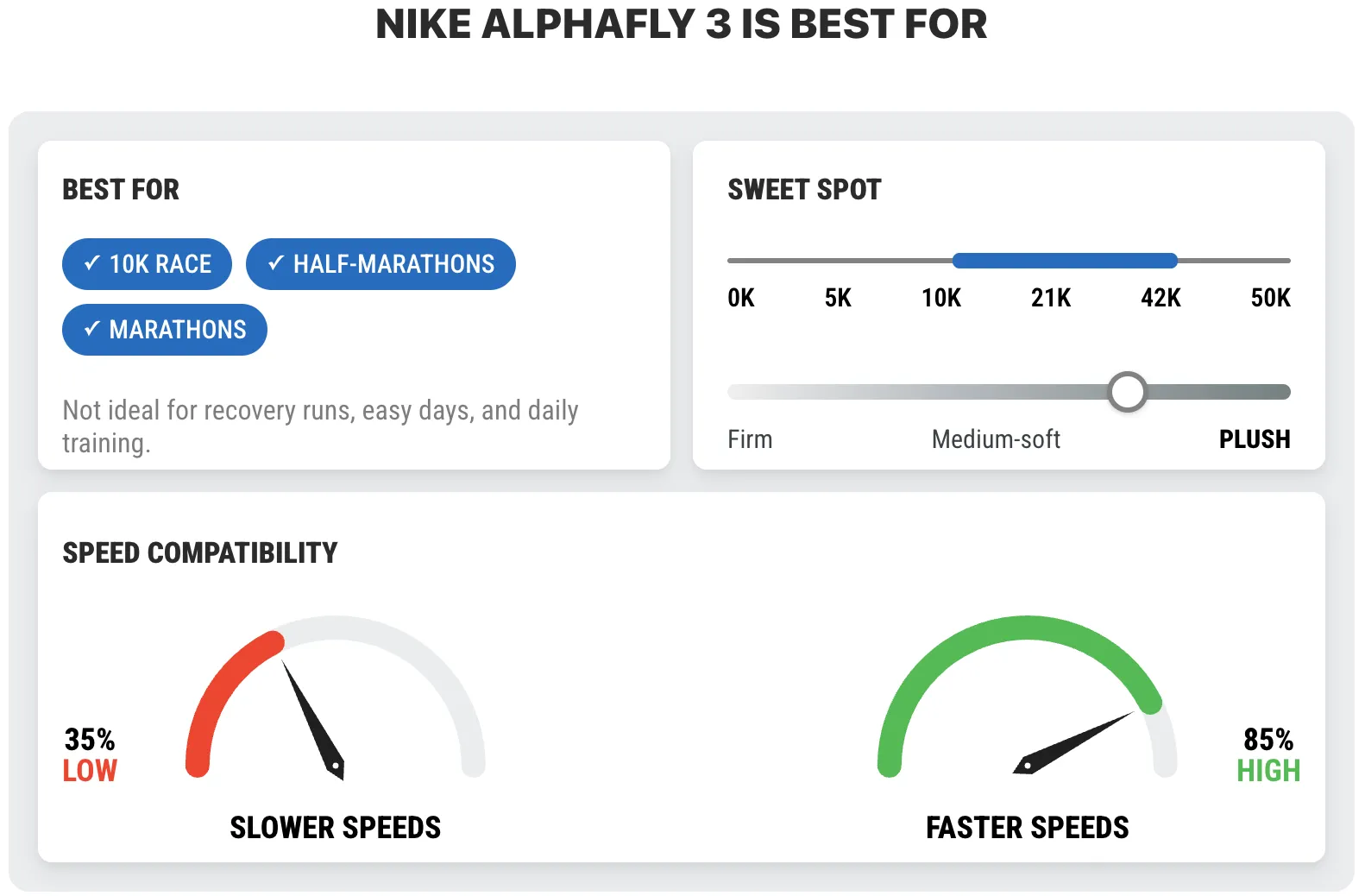
Our ‘Best for’ module is a visual dashboard of sorts, and complements the 30-second review. In mere seconds, it explains intended use, speed compatibility, and ideal distance range. The cushioning sliding range tells you how firm or soft a shoe is. Fun fact – the arrow inside the pace compatibility ‘speedometer’ is based on the Dauphine hand design of the Grand Seiko watch. The speedometer spools up when the page first loads. We thought it would look cool – and it does.


The fit visualizer is a dynamic and interactive version of the static infographic from our older reviews. A toggle lets you switch between the side and top view; this way, you don’t have to scroll down. Fun fact – in the sizing bar at the top, a shimmer or reflection effect passes through the highlighted size bar (eg., Just right, true-to-size) every few seconds. This was inspired by the interactive in-game objects in the video game The Last of Us that have a similar shimmering effect.
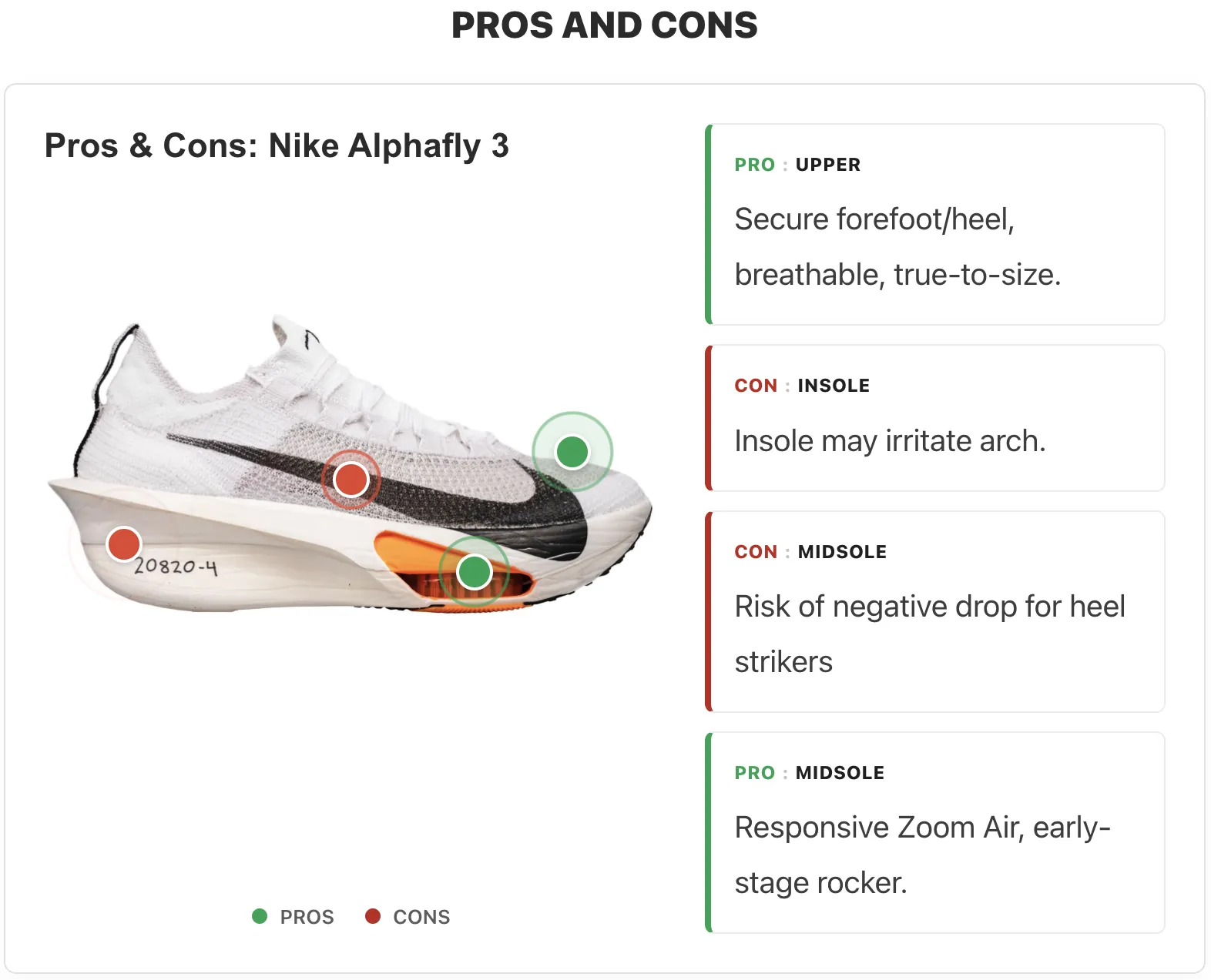
The Pros and cons module is designed similarly to the fit visualizer, except that the hotspots are colored green and red, depending on whether it’s a pro or con.
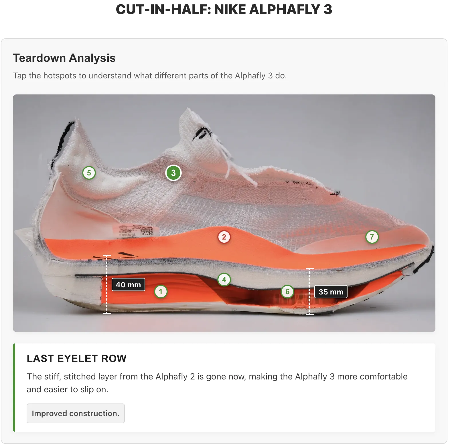
Solereview was the first website to cut shoes in half nearly 18 years ago. We decided to take this to the next level by making the teardown interactive. Here, we explain what each part of the shoe does and how it affects fit and ride quality. It’s also worth mentioning that our stack height measurements, while verified with a digital caliper, deviate from World Athletic standards. While World Athletics’ method isn’t wrong, it doesn’t account for evolved footwear designs (a topic that warrants a separate article). So we follow footwear industry best practices for measuring stack heights. We measure stack heights under the heel and forefoot loading points. In technical terms, that would be the base of the calcaneus and the start (base) of the first metatarsal – those are the front and rear loading points for the foot. If a footwear last is placed on its medial side on a flat surface, the heel and forefoot contact points indicate where stack height should be measured.


Our previous-generation reviews contained dozens of studio-shot images because we wanted to show detail like no other website did. The magnifier module does a better job, but with fewer images. High resolution images from different angles can be magnified up to 400%, allowing the reader to examine the shoe in never-before-seen level of detail.
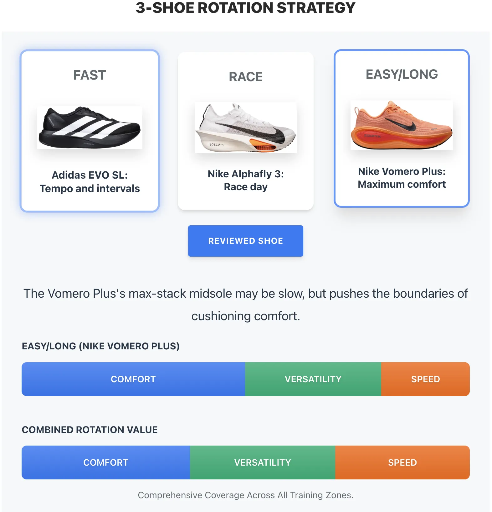
We converted our rotation infographic into a dynamic format. Each shoe is assigned weighting depending on how well it balances comfort, versatility, and speed. Each shoe’s relevance across all three traits is shown on a dynamic range bar, with clickable elements that encourage exploration. At the bottom is the combined rotational value. For a three-shoe rotation – daily trainer, tempo shoe, and easy/long-run shoe – the combined value reflects the weighted average of comfort, versatility, and speed. Since Solereview was the first website to popularize the 3-shoe rotation strategy in 2016, it’s only fair that we’re the ones to evolve it. Future updates to this module will allow readers to select more options than the default recommendations.
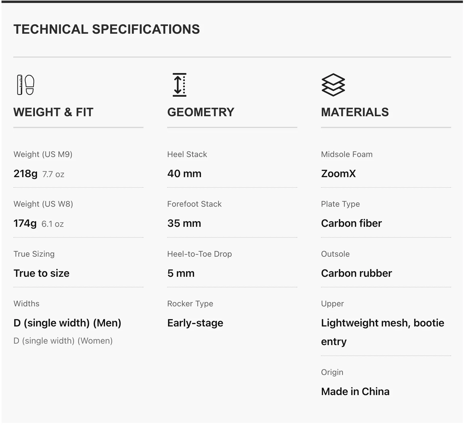
Our reviews end with a basic spec sheet. It’s an evolved and improved version of existing specification tables, as the information is now consolidated into three sections – Weight and fit, geometry, and materials.
What’s next for Solereview?
To say that we have learned a lot from the redesign process is a monumental understatement. We’ve gained a wealth of information and know-how in the last few years, and will apply that knowledge to introduce new features that will help readers find shoes that work best for them. In the near term, we are focused on two things.
First, we’ll begin delivering content in the new format. Currently, in addition to the Nike Alphafly 3, three existing reviews have been ‘remastered’ with all the new modules – the Hoka Bondi 9, Asics Metaspeed Sky Tokyo, and Metaspeed Edge Tokyo.
However, upcoming reviews will not be presented in the all-in-one ‘super review’ format. Considering the high information density, cramming all the new modules into a single review will increase the cognitive load. Beginning mid-April, content on new running shoes will be split into four parts. The main review will contain the profile-based scoring, biomechanics modules, pros and cons, 30-second review, best for, and specs module. That makes sense, as the profile-based scores and bio-mechanical frames give the reader a complete picture of the shoe. Both those modules inform the reader how the shoe behaves under different pace and gait variables, as well as connecting the upper fit and ride characteristics to on-road behavior. The 30-second review, best for, and specs modules add value through summarization.
For true running shoe geeks who want to know more about a particular shoe, related content on the teardown analysis (cut in half), model vs. model comparison(s) and ‘how does a so-and-so shoe fit’ will provide greater detail. Using a hypothetical example, upcoming content for the new Asics Superblast 3 will be split into four parts, making it easier for the readers to digest the information.
1. Biomechanics – Asics Superblast 3 review: This will be the definitive review for this shoe, as it contains all the six modules necessary to make the review complete. The 30-second summary, specs module, ‘best for’ module, pros and cons, profile-based scoring, and (interactive) bio-mechanical animation by pace + gait covers everything one should know about the Superblast 3 to make an informed decision. This review is based on our vast and updated library of high-speed images from actual road races. As far as running shoe reviews go, this is the single-source of truth.
2. Teardown: Asics Superblast 3: In this section, we will cut the shoe into half and explain the features of the shoes using our interactive teardown module. Readers can click on the targeted ‘hotspots’ on the high-resolution image to find out more about a specific component. In the following year when we review the Superblast 4, we’ll include a ‘before and after’ slider as we will have teardown images for both the present and past versions. A 30-second summary with teardown specific content will be also included. A magnifier module will allow the reader to observe the cut-in-half image in greater detail.
3. How does the Asics Superblast 3 fit?: Using our dynamic fit visualizer, we’ll focus on the minutiae related to the upper fit. A 30-second summary with upper fit related content will also be included. Our image magnifier module will let the reader zoom in on different angles (side, top) of the upper. Our model-to-model sizing convertor will be a part of this section, as it lets the reader compare the fit and sizing of 60 different models, the Superblast 3 included.
4. Superblast 3 versus Superblast 2: This content format compares two versions of the shoe, or two entirely different models. For example, we can compare the current version of the shoe (Superblast 3) with the previous one (Superblast 2). Alternatively, the article may focus on a comparison between the Superblast 3 and Novablast 5. Here, our interactive slider will help our reader understand the functional differences between the compared shoes. Instead of the spec module, we’ll include our drop-down comparison tool, as it does a much better job of summarizing not only the specs, but also the fit, ride, and use cases. The 30-second summary module with relevant content will provide succinct talking points.
This editorial approach splits model-specific content into two categories – ‘must have’ (profile-based scoring, biomechanics) and ‘nice to have (teardown, comparisons, upper fit detail). These parts will not be published simultaneously, nor do they follow a specific sequence. Our biomechanics and profile-based scoring modules are based on race-day data, so we might first choose to publish a comparison, teardown, or upper fit article. Not only does this approach reduce the cognitive load, but it also speeds up content creation and access. For example, if a reader is an advanced runner who doesn’t care about profile-based scoring but merely wants to know how the new Superblast 3 compares with the Superblast 2, the stand-alone comparison article will be helpful. Some geeks may want to see, and have a cut-in-half image explained in greater detail.
In March, we also launched four size conversion tools – a universal sizing convertor that translates all five major shoe sizes (US Mens, US Wmns, UK, FR/EU, and JP/CM) across 12 major brands, a foot length to brand size translator, and two model specific size convertors. One translates the foot length into a model specific size, and another lets you compare the sizing of one running shoe model with another. These tools appear deceptively simple on the surface, but were incredibly hard to get right – we spent two years thinking about how to create a functioning version. Read more about it here, or jump straight to one of four sizing translators using the carousel below.
Try our other sizing tools.
Compare fit across models.
Find out which model runs narrower or wider.
Foot length to brand size.
Convert foot length (cm/in) into a brand's general size.
Universal brand size convertor.
Compare sizing across different major brands.
Foot length to model size.
Convert foot length (cm/in) into a model's specific size.
We’re reinventing Solereview in three phases. Phase 1 involves reimagining our editorial formats; phase 2 involves tools like the sizing convertors to reduce layers of guesswork and friction. Both the phases (1 and 2) are ongoing, as we have future refinements planned for both. As for phase 3, it’s extremely ambitious in scope and scale, so we’ll tell you more when the time is right. We’re incredibly excited about the future; thank you for being a part of our journey.